Chart patterns can be used to identify typical chart situations that have evolved over time as a result of the actions of market players. Frequently, dissolving these patterns leads to lucrative price movements. In this series, we would like to introduce some of these patterns to you so that you can improve your market assessment and timing.
The start is made by the pattern of the flat base. Like most price patterns, the emergence of the flat base is based on trends and the behaviour of market players. Within trends, corrections can take place over the price or time axis. Flat bases are the representatives of correction over time. In upward trends, this price pattern usually becomes visible after strong price increases in the chart. During this phase, the price moves sideways within a trading range over a certain period of time. The expected duration of this correction cannot be predicted accurately. As a rough rule, you can fall back on the behavior of the corrections via the price axis. Depending on the market phase, flat (20 to 30 percent), medium (50 to 60 percent) or deep (from 75 percent) corrections are made to the previous movement.
With reference to the correction over time, the duration of the previous price increase serves as an indicator. For example, if the price increase has lasted for 20 days, the correction could take four to six days in strong phases, while the reluctance of buyers in weaker phases can last ten to 15 days. This type of pause indicates a rather low interest in profit taking by market participants.
Another feature of functioning bases is a decline in trading volume. This decline is an additional indication of the low interest of sellers, who often hold the sceptre in corrections over time. We can see from this that the restless traders are not active.
Flat bases in chart
In practice, it is precisely this fact that often leads to strong price gains when breaking out of the formation in the direction of the overall upward trend and is usually associated with a strong increase in trading volume. In order to keep the estimation of the volume component simple, a visual check in the chart is sufficient. Here you can often see increases of well over 50 percent, which is an indication of the activity of institutional investors.
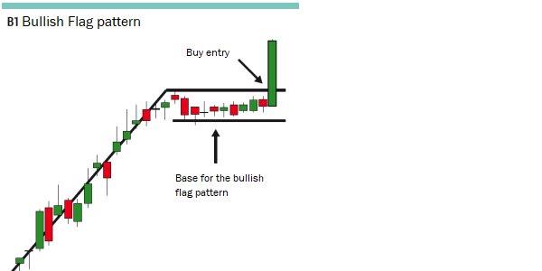
For visual support, simply draw a horizontal line across the highs of this formation in the upward chart (Figure 1). If the price rises above this line, it is a signal for the continuation of the trend. Please note the time component already mentioned. The formation of the pattern takes some time. So the first or second breakout attempt is often just that: an attempt. Pay close attention to the volume. A tarnishing of the old high points under low volume is an indication of the correction that has not yet been completed. If you are undecided, wait for the day of the eruption. This will allow you to see if the volume has increased and trade the confirmation of the outbreak. The price increase does not end after one day if the outbreak is working.
Source: www.investorschule.de
Image 1: The chart shows the construction of a bullish flat base after a strong price increase in the upward-trend and marks the area of the position opening.
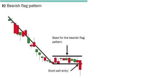
For traders trading both up- and downtrends, this chart formation can also be traded in existing downtrends. In this case, look for the bearish price pattern after an initial sharp slide. Here, too, trading volume should decrease during this period, indicating a lack of buying interest. Draw the horizontal breakout line below the sideways running low points of the correction (Image 2). A downward breakout with increasing trading volume represents the point for opening a position.
Source: www.investorschule.de
Image 2: This chart shows the composition of a bearish flat base as a correction after a significant price decline within a downward trend and illustrates the point at which the position was opened.

Practical example
In November 2017, the Boeing (BA) share started a strong rally at a price of USD 265, which peaked shortly before Christmas 2017 at around USD 300. From this level a flat base was formed until the beginning of January 2018, in which the trading volume visibly declined (Fig. 3). On January 05, 2018, this formation broke out under high volume. Here, a long position was opened at 300.20 US dollars. The stop order to limit losses found its place just below the base at 292.75 US dollars and was trailed to the 305.05, 314.90 and 329.75 US dollars mark in the further course of the trade. The position was closed at USD 345.08 on 18 January 2018. The reason for this was the increasing selling pressure with increasing trading volume.
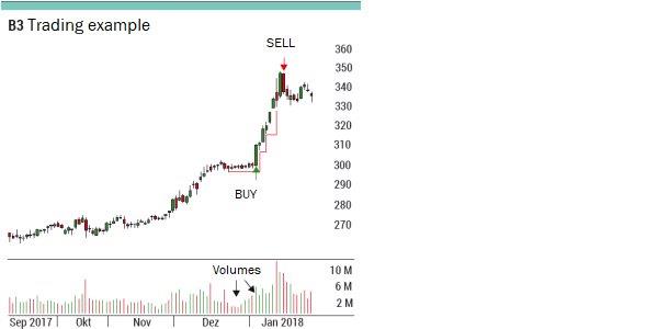
Image 3: The chart shows the long trade in the Boeing share, which was opened with the breakout from the consolidation pattern of a bullish flat base under high volume (green arrow). During the previous correction, the sharp decline in trading volume was evident. The initial stop to limit losses was placed just below the low of the flat base and followed in the further trend (red line). The position was sold before reaching the stop (red arrow) due to increasing selling activity with increasing volume.
Conclusion
The emergence of a flat base indicates the absence of restless hands. This is a very big advantage, because the fewer sales there are, for example, in a breakout from this chart formation within an uptrend, the lower the probability of a false breakout. Furthermore, high-volume breakouts often attract more buyers into the market in this context, which then leads to the continuation of the movement that has begun.
Courtesy of TRADERS´: www.traders-mag.com